When you’re creative and resourceful enough to have made products you can sell for a profit, you’re already on a good track.
But what happens when you need to take pictures of them for your website?
Are you confident you can take good enough photos that will be attractive and aesthetic while being practical and showcasing the uniqueness of your merchandise?
High quality photos of your product can take it from mediocre sales to best seller. After all, we tend to associate lousy photographs with buying something secondhand on eBay or Craigslist.
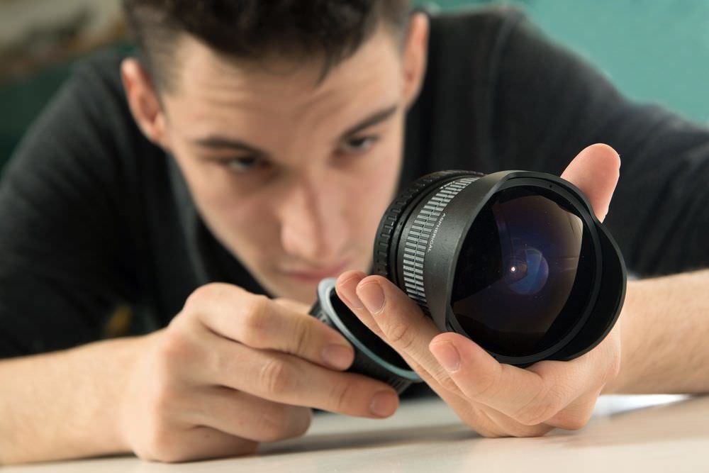
Well-designed websites never have crummy photography. And since most of us aren’t photographers by nature (or formal training), we could all use a little help in learning how to take great photos that will fit perfectly with a professional website.
And here’s the good news: you don’t need to spend loads of cash to produce great photos. You can seriously up the quality of your images with a relatively small infusion of cash.
Think of this article as a crash-course in product photography!
If you’re more of the video type, check out this tutorial:
https://www.youtube.com/watch?v=LGb3j1CyH0k
What You’ll Need
To do your own photography on a budget is easier than you might realize. Basically, you need a camera—the precise quality doesn’t matter—and several things to create a proper set. They are:

-
A tripod.
Without getting too technical, part of good photography is finding the right f/stop—which defines the area of focus—which is dependent on the speed of the shutter.When you use a slower shutter (which allows more light into the camera), you can’t hold the camera or your pictures will be blurry. So, you need a tripod. Several good ones are available for under $30.Without a good tripod you’ll take wobbly pictures that only appeal to people taking acid. I suppose that could be good depending on what you’re selling.
“http://s14.postimg.org/wxpm3p5ap/Product_Photography_Tips_A_DIY_Approach_to_Prof.jpg” target=”_blank” rel=”noopener”Image source
-
A white background.
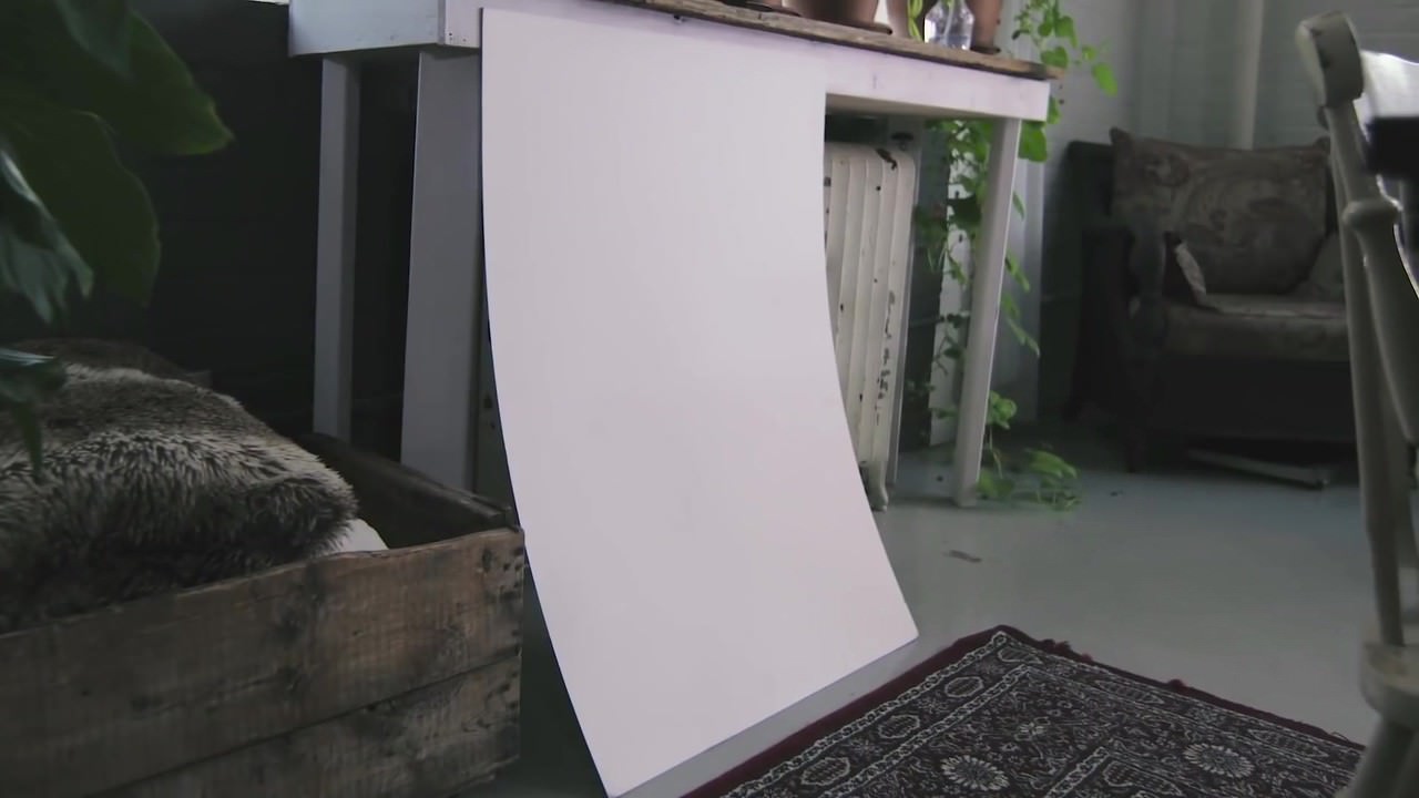
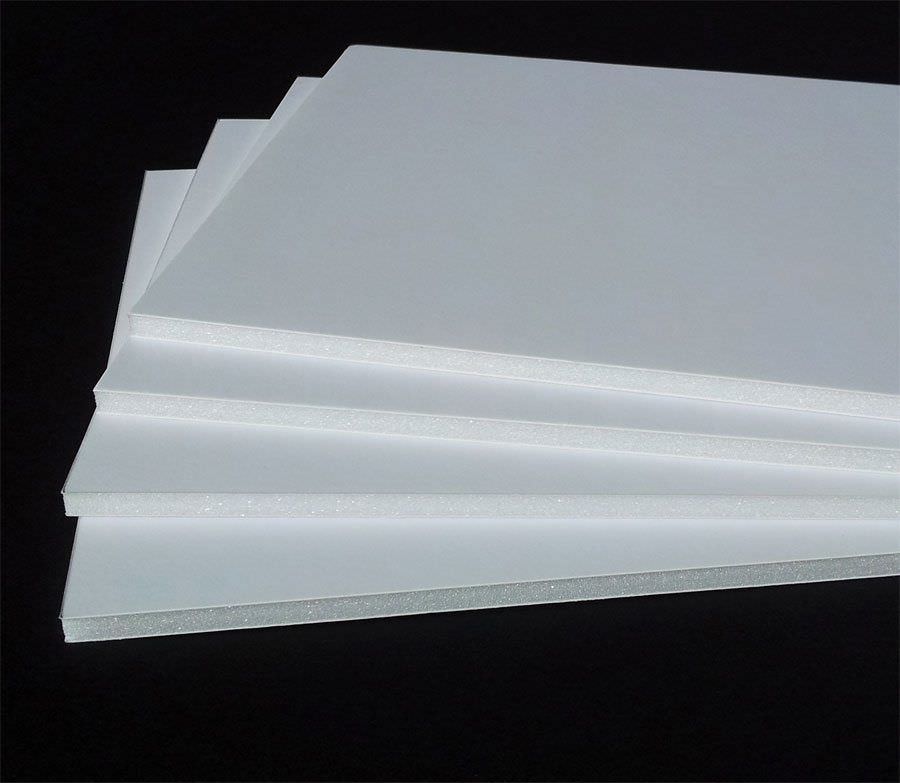
This is easily obtained. You could go to a local photography store and purchase a “white sweep.” Or, you can pop over to an art supply store and get a 32×40 pure white Mat board (the thinnest kind available) for under $7.It needs to be thin so it can be bent. This will be important later. Make sure you get pure white, as this is necessary for proper background form.
“https://www.deansart.com.au/www/715/files/i1_foamboard_white_1.jpg” target=”_blank” rel=”noopener”Image source
-
Bounce cards.
These reflect light off themselves onto the item being photographed. They can be made inexpensively by using foamcore—simply score them in half, so they bend at an angle. They only need be roughly the height of the item and about three times as wide.On another note, foamcore also sounds like slightly intense type of rock music. But that’s for another post.
-
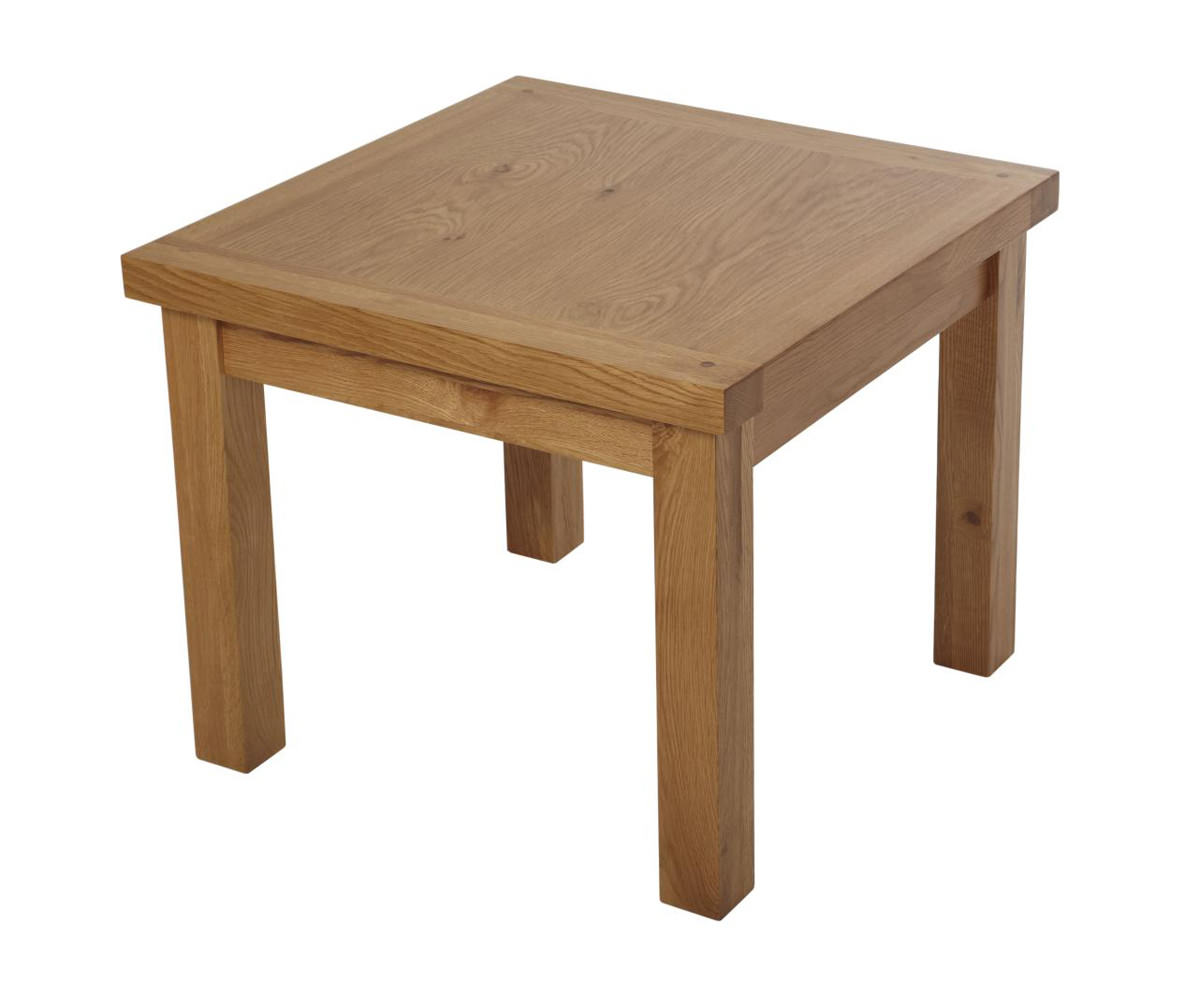
A table.
Any kind will do as long as it’s between 24 to 27 inches wide.
-
Masking or duct tape.
This will secure your background to the wall and table.
-
A room with windows.
This process relies totally on natural light, so the bigger the windows, the better. Just make sure you can move the table out of direct sunlight. Don’t take photos in your basement unless you want them to look they were taken by a serial killer.
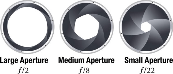
(image via https://photography.tutsplus.com)
These are examples of f/stops. The smaller the number, the more light is allowed into the camera and the more focused the image will be.
Here’s a simple explanation of aperture:
How It’s Done
-
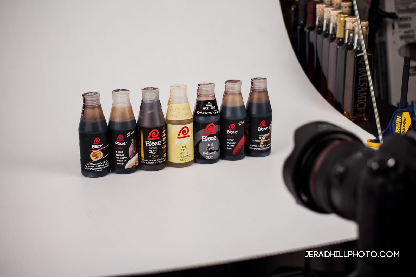
Push the table against the wall.
Make sure it’s as far as it can go while being out of the shadow from the windowsill. (Ideally the window ought to be to either the right or left-hand side of the table if you are facing the table.)
-
Take your Mat board and curve it
, with one end touching the wall and the other resting on the table’s surface. Tape both ends down. Make sure you leave enough room to not have your product right at the tape edge.Nothing looks more unprofessional than a piece of duct tape next to your product. Unless you’re selling duct tape.
-
Score a bounce card if you haven’t already.
Fold it in half and place it opposite the window on the background. This way, the natural light coming in from the window will reflect off the card onto the product.
-
Place your product on the background beside the bounce card
, but not so close that the card will be visible in the camera lens. You want its effects without displaying it.
-
Make sure to not have any artificial lights on in the room
. This will contaminate the set.
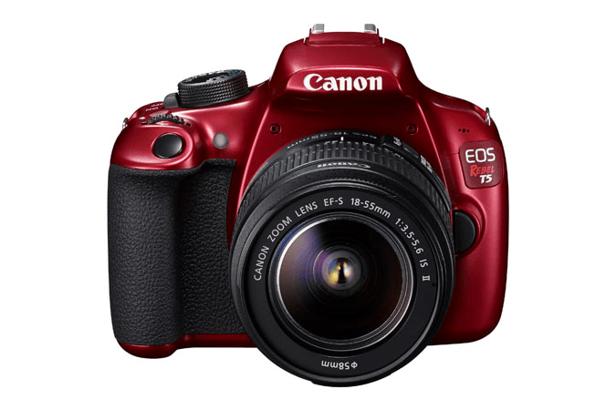
(image via https://shop.usa.canon.com)
The Canon EOS Rebel T5 Red EF-S 18-55mm.Price tag? $399.99.
How to Take the Picture
I said above that any kind of camera—including the kind that comes on a good smartphone—will do just fine.
Some of these next directions will depend on the kind of camera, so make sure to pay attention to your specific model. But they will bring about the same results.
-
Turn off your flash, set White Balance to Auto, and set Image Settings to the largest quality available
. There are two ways to do this depending on the camera. If your camera has a raw setting, use it (but realize you will need to do some editing later in Photoshop or a comparable program).
-
If you do not have a raw option, just use the largest JPG setting you have
. (This will mean setting the size to large and the quality to superfine, at least on Canon models.) The other part of proper image setting is adjusting ISO; lower is better. Usually, this means 100, which is the lowest option on most models.
-
Next, adjust exposure
. Ideally, you will use the manual setting (which is perfect for product images since everything is immobile). Next, check the shutter speed; look at the image through live view and rotate the speed dial until the image is properly exposed.(The lower the number on the dial, the more light it will let in. You want to make sure the exposure is neither too dark nor too bright.)
-
To zoom, make sure you use optical as opposed to digital
; the digital version is basically a crop of the digital image, which results in a grainy, blurry picture. Go as far as you can on the optical mode.
-
You can adjust the angle of the camera, the card, and position of the product depending on the look you want and what you’re trying to communicate.
Experimentation is encouraged!
-
Take the picture!
When you take your photos, make sure to avoid these common mistakes:
How to Evaluate a Photo
After shooting, you must examine the photo to see if it fits what you’re trying to do. You might need to fiddle with placement and angles and reshoot.
Uploading the images to your computer—especially by using a program like Adobe Lightroom, which can also be used for all except the most advanced editing processes—is essential for in-depth evaluation.
This process may take time, but you will get better through trial and error.
Retouching
If your photos are properly taken, the background will look light grey and the exposure will be correct. It is best for beginning photographers to outsource this part, as doing it involves advanced Photoshop usage which will be very confusing and overwhelming.
An excellent U.S.-based retouching company is “https://www.misterclipping.com/” target=”_blank” rel=”noopener”MisterClipping.com, where you can upload your photos and get a quote for the price.
If you like it, you can purchase the project and they will send your retouched photos to you shortly.
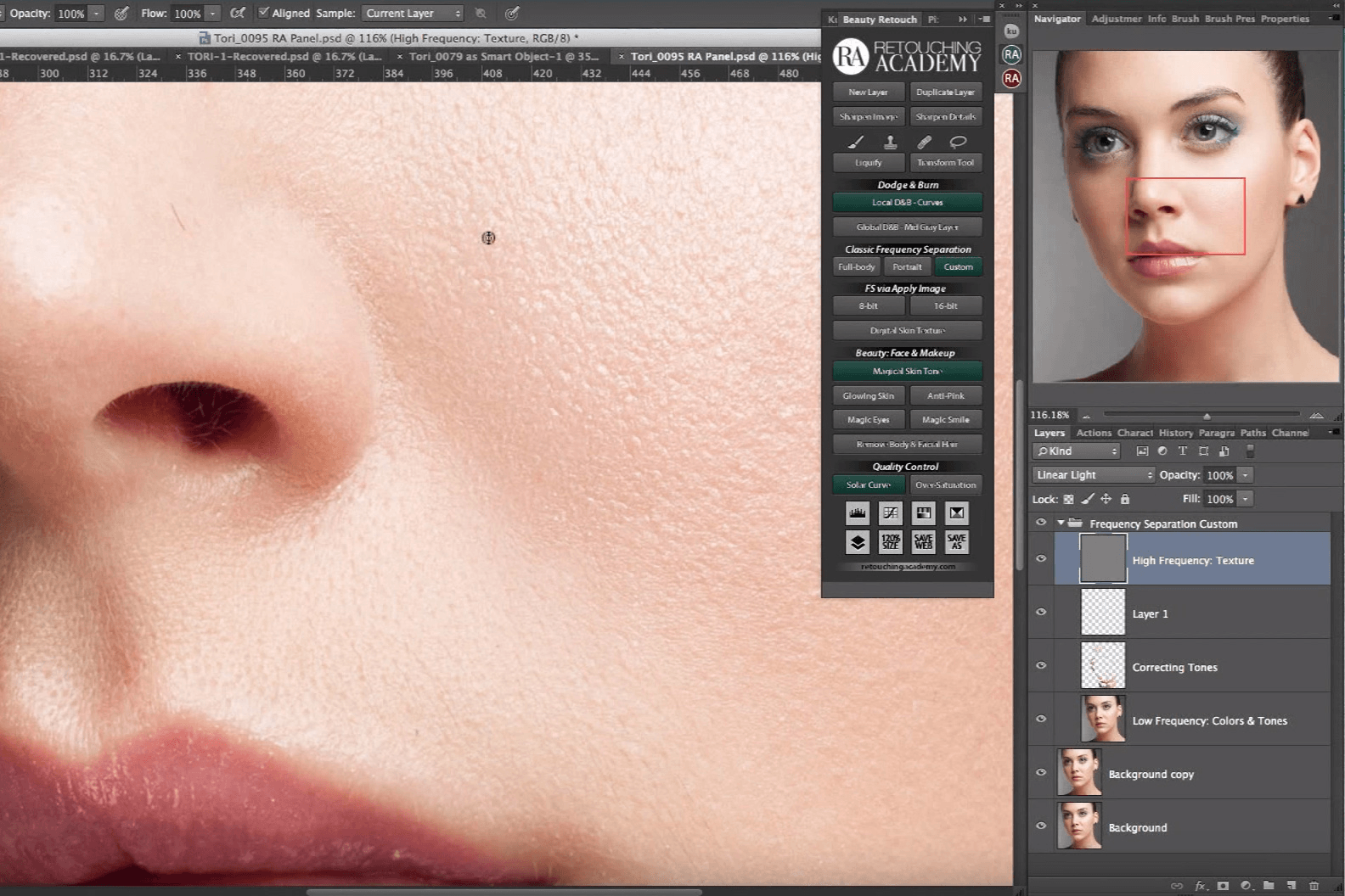
(image via https://www.slrlounge.com)
An example of a photo retouching program.
Uploading to Your Website
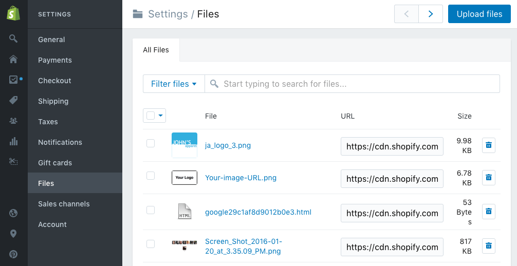
This is that part of the process that depends on (1) your store website and (2) if you followed the directions closely enough. Some websites, like Shopify, will automatically resize the image (massively important if it’s going to look good on the website).
If your website does not offer that, here’s how you can do it yourself:
-
You should have set the camera to the largest possible JPG size
. This is because many images do not retain crispness and sharpness when enlarged, so to make sure a bigger photo is clear, you have to shoot it as big as your camera can make it.
-
Find your image size by right clicking an image on your website
. This will show you the right resolution for images posted there. On Google Chrome, right-click, then click “Inspect,” and a little black box will pop up above the image with the resolution your website uses. (Ignore the larger box that will pop up at the bottom. You don’t need that information.)
In all likelihood, the pictures you have taken will need to be cropped to properly fit the site.
So, find your retouched versions and load them onto Adobe Lightroom.
- Click the image you want to crop.
- Go to the Develop menu.
- Click “Original” (on the right-hand side next to the lock icon), then “Custom.”
- Under “Custom,” type in the resolution size you got from the “Inspect Element” menu on your browser. Click OK.
Then, export the resized images:
- Right-click and select “Export.”
- Jpeg image format
- 70-90 quality
- sRGB colorspace
- Check “Resize to Fit” and choose “Width & Height” from the drop-down menu
- 72 pixels per inch resolution
- Click “export.”
From there, you can upload the images to your website.
Did you have any idea taking your own photography could be so simple?
When you go slowly and allow yourself room to make mistakes, soon you’ll be self-sufficient in an integral part of online commerce.
Related Ecommerce Tips Articles
- 14 Ways to Get Your E-Commerce Customers to Make a Repeat Purchase
- Trends in Global Merchandise Fulfillment 2017
- The Best WordPress Plugins For Supercharging Your Ecommerce
- Drop Shipping: A Low Risk Way to Launch Your New E-Commerce Business
- A Crash Course on Shopify Order Fulfillment

Ready To Upgrade Your Logistic Solution?
Speak to Floship ecommerce logistic consultant about improving your global support chain today

