A landing page is a standalone static web page that is created specifically for marketing or advertising campaigns. It is designed to convert visitors of a site into leads by receiving their email address or other information.
Landing pages are extremely valuable in the process of lead nurturing. With lead nurturing, you get to know more about your leads, for example, where they exactly are in the process of purchasing your product/service. You may even be able to provide solutions to the issues they might be facing. Lead nurturing helps you convert a qualified and interested lead into a customer. With landing pages, you can direct these leads to a specific page on your website so as to give them additional offers. Without landing pages, it is difficult to determine if your website traffic is actually useful for your business.
In general, a landing page is built for a single conversion objective and it is advisable to keep the landing page different from the rest of the pages of your site.
Source
Why do you need landing pages?
While landing pages are used for a ton of purposes, here are some of the most popular ones:
Generate leads: As stated before, landing pages are a great way of capturing leads. Instead of a re-directing email, social media and search traffic to the homepage, businesses can send their leads to targeted landing pages.
Send offers in a better way: Discounts, offers and landing pages often go hand in hand. Landing pages allow the website visitors to ‘pay’ you in terms of contact information in exchange for an offer or a discount coupon.
Understand which leads are more engaged: With landing pages, you can not only attract new leads but also track re-conversions of existing customers to understand which prospects are more engaged with your organization. You can then use this information to offer personalized recommendations and offers.
In this article, we will go through some of the areas you need to focus on when designing a landing page that converts.
1) Design
There is no denying the fact that visual content is more appealing than just a bunch of plain text. A perfect blend of colors, pictures, and layout can make any landing page effective. The human brain can process images 60,000 times faster than text. Images are not only easy to use and fast to load but also grab the attention of users.
If you have a technical product, ensure that you provide a manual or a user guide with proper screenshots. If you do not have any images or graphics of your own, you can use high-quality stock images. Your images should not only be attractive but also visually understanding for consumers. You can even use icons and custom illustrations to tell a story. Stories are very engaging and can substantially boost conversion rates.
The color of the Call To Action (CTA) button needs to be such that it attracts the attention of new customers. In general, CTAs are more effective if their color contrasts with other colors on the page. We have covered CTA in detail in the later section of this article.
2) Testimonials Testimonials
Irrespective of geographical location, age or gender, there is a rule of thumb that exists all over the world in online marketing – People trust people. One of the best ways to gain the trust of a new lead is to include testimonials of existing customers on the landing page. When people see that other people are already engaged with the brand, it provides social proof and makes page visitors more inclined to interact with the brand. Testimonials are a great way to increase credibility.
You can use twitter cards, which is one of the best ways to feature testimonials on the landing page. Twitter cards can win the trust of new users and are impossible to fake since they can be easily verified. If a well-known person has said nice things about your product on social media, you can put that quote on your landing page and make it the face of your campaign. You can also feature companies that are using your product. Today, testimonials have gone beyond just pictures and textual content. You can ask your customers to record a video testimonial for you that can be put on your website.
3) Emotional Triggers Emotional Triggers
Source
Emotional targeting is a new way of targeted marketing that is based on how and why people make decisions. In general, the focus is on fulfilling the emotional needs of the prospects to motivate them to make a purchase.
Broadly, you as a business owner must target two different emotions – Pleasure and Pain. People reach out to a product either because they are facing some problem or because a product gives them joy. You need to identify where your product stands and take steps accordingly.
If the emotional trigger you are targeting is pain, you need to explain how your brand is solving the problems of its existing customers. You must also explain the technique you are using to solve the issues. On the other hand, if the emotional trigger is pleasure, explain how your product will give psychological satisfaction to people who are using your product.
4) A/B Testing
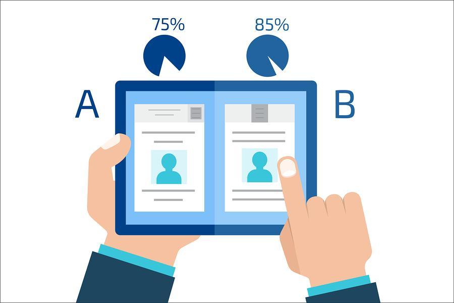
Landing page A/B testing is important if you want to boost conversions. In A/B testing, we compare two versions of the same page to find out which outcome generates better results. A/B testing your landing pages can help you in seeing which version generates more engagement such as conversions or on-site time.
You can compare different combinations of images, design, text, etc to come up with the best outcome that generates the best results with your audience. To find the best landing page, you should use two different emotional triggers (see #3 to know more about emotional triggers) on the respective pages. Based on the conversions of the two pages, you can use one that suits you the best.
5) Build a captivating headline and copy
Source
On average, you have less than 8 seconds to capture the attention of your leads. The headline is often the first thing people see. People will only read through the rest of the copy if your headline is interesting enough. One thing you need to keep in mind is to ensure that you don’t confuse the audience with your headline. Being overly clever can lead to people losing interest in your product.
A headline should not contain more than 20 words, with 10-12 words being the ideal length. Every header should have an objective and should be directed towards a specific group. It should tell you what the product or service is all about. As soon as a visitor visits your landing page and sees the headline, they should get a clear idea of what your company is offering.
Just like the headline, the sub-headline plays an important role too. If the headline is meant to grab the attention of a visitor, the subheadline should encourage them to spend time on the page.
Your landing page should have a crisp explanation of the product or service that you are selling. If the copy is longer, you risk boring visitors and losing their attention. You should emphasize the benefits of using the product/service rather than it’s actual features. Visitors must feel that the copy is written by a human and not a robot. Write the way you speak and keep all of it very simple. Wherever possible, try to get specific by using statistics and numbers.
6) Call to Action Build a captivating headline and copy
Source
Call to Action (CTA) is the most important part of any landing page. Most of the conversions depending on how people interact with the call to action button. Visitors can perform actions on a landing page via the CTA.
Your action word needs to be compelling and persuasive rather than some basic and regular words like “Submit” and “Sign up”. People do not like it when you employ tactics and deceive people into clicking on CTA. You should always try to keep your Call to Action as simple as possible.
Apart from compelling text, you also need the CTA to have vibrant colors in order to grab the attention of visitors. You must use colors that contrast the rest of your page.
You must always try to place the CTA above the fold to make it clear and visible to the visitors. People should be able to see it without needing to scroll otherwise many might just miss it.
Conclusion
All the tips in this article whirl around one goal – convincing customers to take some action after visiting your landing page. The ideal landing page will be different for different brands depending on their audience. However, following the tips mentioned above will definitely set up a strong core that will help you convert more leads.
Ready To Upgrade Your Logistic Solution?
Speak to Floship ecommerce logistic consultant about improving your global support chain today

