Whether a customer makes a purchase or not, is dependent on the experience they have when interacting with your business. If they speak to a rude customer assistant or sales person or they find your store is messy, then it is less likely that they will make a purchase.
The same can be said when the customer is visiting your website. When they visit your website, they are making a judgment about your business based on their experience.
Nothing is more influential on their experiences than the design of your website.
It isn’t just about stopping a customer from making a purchase. If a customer has an excellent buying experience, then they are more likely to return to your website to make another purchase. Therefore, a good website design can help you decrease customer churn and improve your customer’s lifetime value. Both of which are important KPI’s for a growing business.
But what about the design can enhance your customer’s buying experience?
1. Website Speed
Although it is often ignored by small businesses, the speed of your website is critical to the success of your online store.
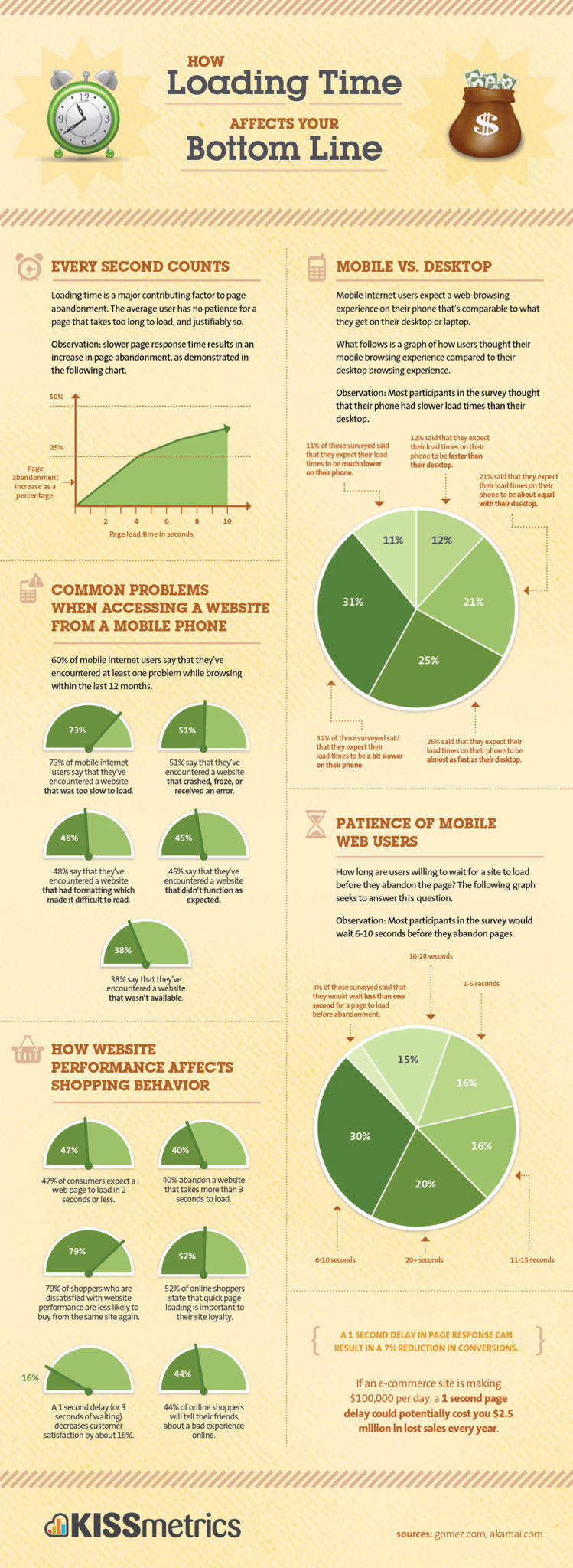
GT Metrix states that the average website speed is approximately 7 seconds, but for every second that your website takes to load, you are losing 7% of your income. This can be a major problem as the average time for a website to load, 7 seconds, means that businesses are losing nearly half of their potential revenue.
At the same time, a three second load time can decrease your visitor’s satisfaction by 16%!

Speed can often be solved by a few quick actions.
Firstly, make sure your “https://hosting.review/web-hosting/fastest-web-hosting/” target=”_blank” rel=”noopener noreferrer” data-saferedirecturl=”https://www.google.com/url?q=https://hosting.review/web-hosting/fastest-web-hosting/&source=gmail&ust=1560997238553000&usg=AFQjCNGkbs7imHSnBBa4L4DC7AZMXoLczg”website hosting provider offers the fastest speeds on the market. Sometimes a quality host is enough to solve the problem of slow load times.
Secondly, you need to optimize the images by having them in smaller, less memory intensive formats.
Thirdly, you should look at minimizing your HTML, JavaScript and CSS. With WordPress, there are plugins that can do all of this for you. For other website systems, you might have to consider other options.
2. The Buying Process
This is one of the most tricky aspects of website design.
Customers want to flow very smoothly from their first step (product research) right through the purchasing process to the confirmation page. Yet at the same time, you don’t want to miss out on any cross-selling or up-selling opportunities.
Testing your site to see how many screens it takes to make the purchase or by the experience of the customer can be critical.
Another tactic to optimize the process is to see the shopping cart abandonment rate. If it is specifically high, you should look at flattening the sales process on your website.
3. Long Term Purchasing Options
Sometimes customers are researching their purchases and will add things into a cart to see what the costs with delivery will be or what the total costs are for their selection. They may then leave your site to do some more research. When they come back, it becomes a negative experience if they have to find those products again.
Therefore, having a visible and accessible shopping cart that stores your visitor’s basket when they leave your site can improve their experience.
4. Payment Process
The speed at which the payment goes through can be troublesome for your clients.
You want to offer your visitors lots of options for making a purchase and you want those to be processed quickly:
The longer it takes for your site to process a payment, the more concern a customer will have that their financial details are safe.
5. Navigation
Jumping from one point to another point on the site is very common for consumers. They want to ensure they are getting a good deal or want to research a lot of different products.
Making it easy for them to find those products helps you to sell more and gives them a better experience.
There are several ways that you can improve the navigation on your website.
These include:
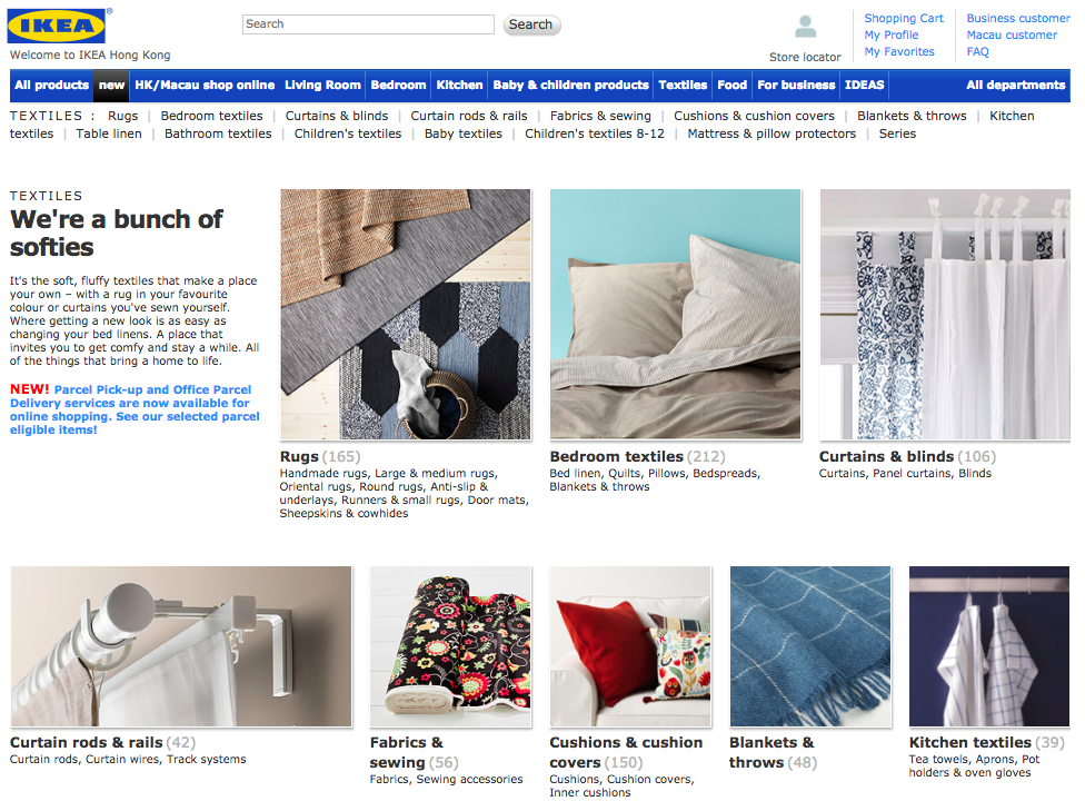
- Search box that can help customers locate products.
- Easy to navigate categories.
- Products divided into sub categories when you have lots of products.

You should also look at decreasing the options available on your website. Customers like to have an easy solution to their product research; “https://blog.kissmetrics.com/loading-time/” target=”_blank” rel=”noopener noreferrer”too many options can decrease your sales, not improve them.
Conclusion
Your website’s design will enhance your visitor’s experience. By improving your website’s navigation, speed–load time–purchasing path and payment process you can enhance the customer’s experience and create a brand loyal advocate who will want to buy from you again and again and will tell others about your site.
How does your website perform? Does it need a redesign to reconnect with customers?
Take Action:
- Study your website design, check for issues.
- Speak to a developer about solving those issues.

Ready To Upgrade Your Logistic Solution?
Speak to Floship ecommerce logistic consultant about improving your global support chain today


